Since this journal post, we have stopped selling personalised cards. We continue to print packaging for our range of vintage lighting products using letterpress and personalise notebooks using mechanical typesetting and letterpress.
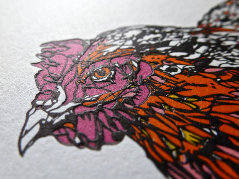
Original post: When the print team first saw this letterpress greetings card project, we liked the design but we were worried it was too much printing for one chicken to handle. Every card would need to go through the press six times and six passes is generally regarded as excessive for traditional letterpress. The personalised card - 'Hen' by Susie Wright card is available to buy; read on to find out how we made a classic letterpress greetings card. Each colour is printed separately and every colour has to match up perfectly with all the others. We call the process of checking to make sure the colours are aligned 'printing registration'. If the colours are not aligned, we say the registration is poor and the image looks blurred or fuzzy. When paper goes through the press it can stretch or deform, and if this happens it is impossible to maintain a good register.

 Our worries were unfounded - seasoned printer Calvin ran the Heidelberg presses perfectly. Each pass adds another level of complexity that was great to see develop. The final image is a fantastic design combined with super high quality execution.
Pass 1 is the black outline and the back of the card, including the Urban Cottage Industries and Print Club London logos and also the designer's name. This initial pass is completed with the minimum possible impression, 'floating' the black ink over the surface of the card stock. The accuracy of this pass requires careful adjustment of the ink flow and precise depth of the packing sheets on the platen to ensure a completely even impression over the entire surface of the card.
Pass 2 is the magenta colour rhodamine red, used mostly for the hen's head. This and the following passes contrast with the initial pass in being deeper and creating the contrast of depths and relief which can only be achieved by inimitable letterpress.


 Pass 3 is another classic ink shade, Pantone orange 021. This was a risky colour because it is concentrated in a small area of the image which increases the chances of the paper deforming or stretching. The worry was that if this pass deformed the paper, we would not be able to get the registration perfect with the later colours. The accuracy required is in fractions of a millimeter.
Passes 4 and 5 are the yellow and light pink sections of the design. Again these are small areas which required only a few grammes of ink to print over 300 greetings cards! The registration is monitored closely as a bad pass at this point would ruin the work done so far.
Pass 6 - the final pass - is the grey. While grey sounds unexciting, we think this was a masterstroke from Susie Wright as it adds contrast and definition to the final image.
It was a joy to produce this card and we love the beautiful and complex design. Our ageing printers and their ageing Heidelberg presses still have a lot to give customers who love traditional print. Enjoy the images, but remember the Hen looks much more special when you have the card in your hands.


Original post: When the print team first saw this letterpress greetings card project, we liked the design but we were worried it was too much printing for one chicken to handle. Every card would need to go through the press six times and six passes is generally regarded as excessive for traditional letterpress. The personalised card - 'Hen' by Susie Wright card is available to buy; read on to find out how we made a classic letterpress greetings card. Each colour is printed separately and every colour has to match up perfectly with all the others. We call the process of checking to make sure the colours are aligned 'printing registration'. If the colours are not aligned, we say the registration is poor and the image looks blurred or fuzzy. When paper goes through the press it can stretch or deform, and if this happens it is impossible to maintain a good register.


 Our worries were unfounded - seasoned printer Calvin ran the Heidelberg presses perfectly. Each pass adds another level of complexity that was great to see develop. The final image is a fantastic design combined with super high quality execution.
Pass 1 is the black outline and the back of the card, including the Urban Cottage Industries and Print Club London logos and also the designer's name. This initial pass is completed with the minimum possible impression, 'floating' the black ink over the surface of the card stock. The accuracy of this pass requires careful adjustment of the ink flow and precise depth of the packing sheets on the platen to ensure a completely even impression over the entire surface of the card.
Pass 2 is the magenta colour rhodamine red, used mostly for the hen's head. This and the following passes contrast with the initial pass in being deeper and creating the contrast of depths and relief which can only be achieved by inimitable letterpress.


 Pass 3 is another classic ink shade, Pantone orange 021. This was a risky colour because it is concentrated in a small area of the image which increases the chances of the paper deforming or stretching. The worry was that if this pass deformed the paper, we would not be able to get the registration perfect with the later colours. The accuracy required is in fractions of a millimeter.
Passes 4 and 5 are the yellow and light pink sections of the design. Again these are small areas which required only a few grammes of ink to print over 300 greetings cards! The registration is monitored closely as a bad pass at this point would ruin the work done so far.
Pass 6 - the final pass - is the grey. While grey sounds unexciting, we think this was a masterstroke from Susie Wright as it adds contrast and definition to the final image.
It was a joy to produce this card and we love the beautiful and complex design. Our ageing printers and their ageing Heidelberg presses still have a lot to give customers who love traditional print. Enjoy the images, but remember the Hen looks much more special when you have the card in your hands.


Leave a comment
This site is protected by hCaptcha and the hCaptcha Privacy Policy and Terms of Service apply.