We have probably the world's largest collection of operational mechanical typesetting machines. The machines are used daily, setting type from molten type metal. The type is used to create personalised journals: enter a name or other words online and we'll set a slug of type which is used to blind deboss the cover of the journal.
In addition to the Intertypes, we've a huge collection of printed material about the maintenance and use of the machines. We are gradually scanning and digitising the material and making it freely available online.
THE typeface and font catalogue - the 'Book of Intertype Faces'
... is available below.
Intertype's typeface and font catalogue - the 'Book of Intertype Faces' shows the huge range of typefaces, fonts, sizes and weights that were available in the 1950s for the mechanical line-casting machines that were used by the newspaper industry, book publishers and jobbing printers. Intertype manufactured mechanical linecasting machines from 1910 to around 1970. Prelogram has what is probably the world's largest collection - around a dozen - of operational Intertype machines. Three of the machines are still in use, casting type using the brass matrices and molten metal. The type is used to emboss Moleskine notebooks and print the text in Prelogram's greetings cards.
Intertype information
|
The introduction to the catalogue contains information about Intertype's matrices and how to order them. The catalogue cost £3 3s 0d, or around £55 at current prices. |
Special characters & leaders
|
In addition to the many typefaces available, Intertype supplied a huge selection of leaders and special characters. Tables were typeset using leader matrices which created horizontal or vertical rows of dots, dashes and solid lines. The special characters include many of those to be found in word processing software today – arrows, fractions, punctuation marks, mathematical characters, ornaments, religious symbols, musical notes etc. |
Antique
|
Originally designed by Vincent Figgins (1766 – 1844) in London, England in 1815. Antique was an early name for the slab serifs also known as Egyptians. The style was probably developed by sign writers in the early 19th century where the heavy letter forms were easier to paint than delicate styles and better suited to display. Figgins served his apprenticeship at the Joseph Jackson (1733 – 1792) foundry in London. He issued his first specimen book in 1792. Figgins set up his own foundry after Jackson’s death which had a reputation as one of the best. Figgins cut type for the Oxford University Press and the East India Company. He was a member of the Society or Association of Letter-Founders, formed in 1793 and ‘Convened for the purpose of taking into consideration the enormous increase of the Prices in the various Articles made use of in the Business of Type Founding’. The Society sought to regulate the type trade by price-fixing and setting terms for the trade. The Society’s response to demands for increased wages from their workmen – casters, rubbers and dressers – was to agree in May 1800 that ‘… no servant be, in future, employed, unless he leave his last place, his work being finished, and clear of debt.’ |
Baskerville
|
Originally designed by John Baskerville (1706 – 1775) in Birmingham, England in 1757. Baskerville began his career as a printer and typefounder in Birmingham in about 1750. His eponymous font dates from around 1757 and reflects the influence of William Caslon’s types and the calligraphic style developed in Italy in the 16th century which had smoother curves and more contrast between thin and thick strokes. It has been suggested that Baskerville did not make his own letter punches but supervised the making of them by John Handy. The original punches are now in the University of Cambridge library. Baskerville’s ‘housekeeper’ was for many years Sarah Eaves. Eaves was married with three children, but her husband had deserted her and fled the country after being convicted of fraud. The husband died in 1764 and Eaves and Baskerville were able to be married. |
Bell Gothic
|
Designed by Chauncey H Griffith (1879 – 1956) at the Mergenthaler Linotype company, USA in 1938. Griffith was born in Ohio, USA and worked for the Mergenthaler Linotype Company from 1906. He started as salesman, then sales manager and by 1948 was vice-president in charge of typographic development. Bell Gothic was designed in 1938 and, though credited to Griffith, was probably a collaboration between the Bell Telephone Company’s typographer and Mergenthaler Linotype. It is a slender sans serif and economical in terms of space. It was both designed and used for telephone directories. |
Bodoni
|
Originally designed by Giambattista Bodoni (1740 – 1813) in Parma, Italy c1790. Bodoni was a printer, typographer and prolific type-designer in Parma, Italy. Bodini was born into a family of typographers and cut around 300 fonts from 1780 onwards. The modern Bodoni fonts are re-cuttings of his original typefaces. The original re-cutting was by Morris Fuller Benton of American Typefounders in 1907. This version was then copied by other foundries, including Intertype. Bodoni fonts have a marked contrast between thin and thick strokes and build on the developments of William Caslon and John Baskerville. Bodoni’s major developments in typography included making upper and lower serifs uniform and thin in contrast to the character stems; and giving the internal bowls and curves of letters a vertical and less rounded internal profile. View pdf - Bodoni typeface part 1 View pdf - Bodoni typeface part 2 View pdf - Bodoni typeface part 3 View pdf - Bodoni typeface part 4 View pdf - Bodoni typeface part 5 View pdf - Bodoni typeface part 6 |
Bookface Old Style
|
Designed by Alexander Phemister (1829 – 1894) at the Miller & Richard Foundry in Edinburgh, Scotland c1860. Phemister was born in Edinburgh. After his apprenticeship with a punch cutter, he worked for the Edinburgh type foundry Miller & Richard. Phemister completed Old Style in 1860. He emigrated to the USA in 1861 where he cut Franklin Old Style based on Old Style for his new employers – Phelps, Dalton & Co, Boston USA, which became part of the Dickinson Type Foundry and then American Type Founders. Phemister’s Old Style was intended to have old-face qualities but without the archaic aspects of Caslon Old Face. The serifs are finer and sharper than Caslon. Old Style was very successful and much copied. Intertype’s version was called Bookface Old Style and there were Linotype versions called Bookprint and Dickenson Old Style. View pdf - Bookface typeface part 1 |
Cairo
|
Cairo was an Intertype typeface based on Memphis designed by Rudolf Wolf at the Stempel foundry in Frankfurt, Germany in 1929. Cairo is very similar to, and no doubt derivative of, the Memphis face designed by Rudolf Wolf in 1929. Wolf was employed by the Stempel foundry in Frankfurt, Germany. Memphis was the first font in the modern Egyptian revival style. A characteristic of the Egyptians is, of course, the extensive use of slab serifs – the blocky flourishes at the end of the characters. View pdf - Cairo typeface part 1 View pdf - Cairo typeface part 2 |
Caslon Old Face
|
Caslon Old face was originally designed by William Caslon (1692–1766) in London, England c1725. Caslon is perhaps England’s most famous type founder. He was born in Worcestershire and apprenticed in London in 1706 to a metalworker who specialised in engraving of gun barrels. Caslon’s first face was completed in 1724 and his first complete specimen sheet dates from 1734. Types from Caslon’s foundry were commonly used for printed matter in the next 50 years both in Britain and North America. Caslon’s foundry moved to Chiswell Street East London around 1737 and remained there until 1936. Caslon Old Face is based on Dutch types from the late 17th century. The typeface has been much copied in the three centuries since it was first cut. Most foundries had their own versions or variations of Caslon Old Face. Intertype’s Caslon Bold was re-cut in 1960. |
Century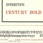
|
Designed by Linn Boyd Benton (1844 – 1932) at the American Typefounders Company, USA in 1894. Benton co-owned a type-foundry which merged with others to form the American Typefounders Company in 1892. Century was designed by Benton in 1894 in collaboration with Theodore Low De Vinne for the publishers of the Century Magazine. Century was blacker and more readable than the font used previously, and slightly condensed to fit the two-column layout of the magazine. Century Expanded was released by American Typefounders in 1900 and there followed numerous variations. Century was Benton’s only face, though he originated other advances in typography. His invention of an effective punch cutting machine apparently ‘saved’ the Linotype machine. The discovery of Benton’s punch cutting machine by Linotype’s Attorney – Philip T Dodge – meant Linotype could produce a large number of punches, which in turn allowed the manufacture of an unlimited number of matrices. The Linotype machine could not have been a success without mass production of matrices. View pdf - Century typeface part 1 |
Cheltonian
|
Cheltonian was an Intertype typeface based on Cheltenham designed by Bertram G Goodhue (1869 – 1924) for American Typefounders and Mergenthaler Linotype, USA c1902. Goodhue was an architect in the Gothic revival style. He is known for a number of Gothic religious buildings, the US Military Academy buildings at West Point and the Nebraska State Capitol. He was a follower of William Morris and, in addition to Cheltenham, he designed an altar book in 1896 using the specially designed Merrymont typeface with gothic borders and ornaments. Despite being described as ‘gently idiosyncratic’, ‘unattractive’ and ‘strangely popular’, Cheltenham has been much copied. As well as Intertype’s Cheltonian face, Stephenson Blake issued a version of Cheltenham called Winchester, and Monotype a version called Gloucester. View pdf - Cheltonian typeface part 1 View pdf - Cheltonian typeface part 2 |
Cloister Old Style
|
Designed by Morris Fuller Benton (1872 – 1948) at the worked for the American Type Founders Company, USA c1897 Benton worked for the American Type Founders Company becoming chief designer around 1900. He was a prolific designer of typefaces and his work included Franklin Gothic and the re-cutting of Bodoni. Cloister Old Style is based on the roman face of Nicholas Jenson (1420 – 1480) designed and cast in Venice. The revival of the Venetian style was due in part to the work of William Morris. It has been suggested that Intertype’s Cloister Old Style can be distinguished from Benton’s in that the ‘e’ has a straight bar, though if there is a difference it is hard to perceive. |
Cornell
|
Designed for the Intertype Corporation in Brooklyn, New York, USA in 1948. George F Trenholm (1886 – 1958) was born in Cambridge, Massachusetts and designed several faces for the Intertype Corporation. Cornell was his last typeface for Intertype in 1948. Interytpe described the face as ‘unobtrusive in character, with a quiet easy readability, with an evenness of colour, now so frequently sought for in the modern book page, and with a splendid legibility for a wide diversity of periodical and jobbing work. Subtle change of stroke from thick to thin, carefully considered distribution of weight, and a confident serif formation, help to impart to Cornell an appearance which is undoubtedly modern.’ |
De Vinne Modern
|
Originally designed by Gustav F Shroeder (1861 – ?) at the Central Type Foundry in St Louis, USA in 1890. Schroeder was born near Berlin and apprenticed as an engraver. He emigrated to the US in his 20s and worked at the Central Type Foundry in St Louis. Schroeder designed many typefaces in a range of styles for Central Type . De Vinne was created in 1890 and there are many variations of which De Vinne Modern was Intertype’s. The face is named after Theodore Low DeVinne (1828 – 1914), the American printer and typographer. DeVinne authored a number of books on printing, typography and composition. DeVinne was instrumental in the creation of the Century Roman typeface. View pdf - De Vinne typeface part 1 View pdf - De Vinne typeface part 2 |
Egmont |
Designed by Sjoerd Hendrik de Roos (1877 - 1962) in Amsterdam, The Netherlands, in 1933. De Roos was known as 'the first professional typographic designer in the Netherlands'. He trained as a lithographer and was influenced by the Arts & Crafts movement. He was employed by the Amsterdam type foundry between 1907 and 1947 and designed a dozen typefaces, book covers and stamps for the Dutch post office. Egmont is a re-working of classic letterforms and features long downstrokes and double serifs. View pdf - Egmont typeface part 1 View pdf - Egmont typeface part 2 |
Engravers Old English |
Designed by Morris Fuller Benton (1872 – 1948) in the early 20th century - see Cloister above for biographical information. Similar faces had been used for hundreds of years before its revival by Benton. As the name suggest, the face was modelled on the work of engravers.There are a number of similar faces including Linotype's Old English text and Monotype's Old English. |


Leave a comment
This site is protected by hCaptcha and the hCaptcha Privacy Policy and Terms of Service apply.